Designing An Android Widget
Three principles to think about before diving into the code
Just to make this clear from the start: This article will not help you with coding up your Android app's widget. It’s about getting the right pieces of information across. Lars Vogel might have some tips here for you, though.
But read on anyway.
Right from the start when Google released Android 1.0 in 2008, widgets were a defining element of the OS's desktop and experience. In fact, it was one of the few distinguishing pieces competing against Apple's mighty iPhone and iOS and it still is today. Widgets became even more important when Android spread out to the large screen on tablets and most recently with Jelly Bean 4.2 on the lock screen.
To make this short, if you want to build a solid application for Android, you definitely want to provide a decent widget with it. And let's not forget that the first paid app that crossed one million downloads was a set of standalone widgets called, you guessed it, Beautiful Widgets.
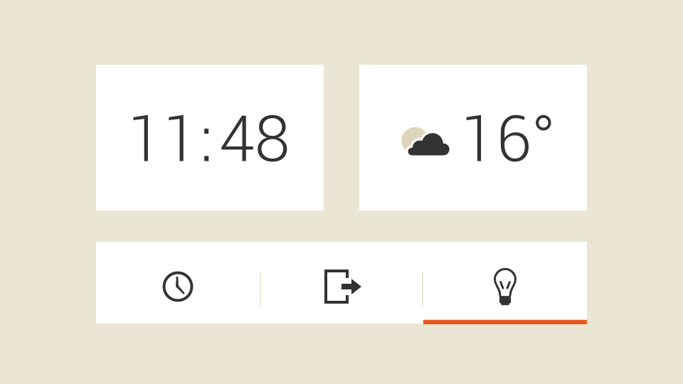
Let's think about this for a moment: A widget is more or less a flexible, quickly accessible subset of information or features of your application. Depending on the complexity of your app, you might even go as far as implementing all of its functionality within the widget.
There are three core purposes of an Android widget:
Quick Access
Launching an application and getting to the data you're looking for sometimes takes forever. You have to find the right icon, select it, wait for the app to launch, wait for the data to be pulled and finally navigate to the essential piece of information. You don't want your users to go down this route all the time, right?
Figure out which are the most frequently used functions of your app and provide those within a widget. A good example is the playback control of most music players, giving quick access to play/pause and next.
Continuation
Your users might spend a lot of time with your application, especially if it's a reading or media app, giving access to vast libraries of content. But since we're talking about mobile devices, there's a good chance that your user has to break up doing whatever your app is providing rather frequently. Maybe if the bus reaches his destination or the meeting is finally starting.
If that is the case, the first thing someone might want to do is continue where she left off, the last time using your app. A well crafted widget might be the perfect place to do so. Every reading app should have a widget showing recent articles, as every browser needs a list of your latest bookmarks or sites in general.
Inspiration
The last purpose of a widget might be the one most developers underestimate, especially the ones not familiar with Android's strengths. How often do you just unlock your screen to waste some time, spend some minutes with your device or just fool around, with nothing particular in mind? This is the time, where we might be looking for some inspiration. There might be no better place to get some inspiration than a small widget somewhere on one of your homescreens.
How about a new app to download from the market or a song to check out, based on your recent interests? Maybe show the face of a friend your user hasn't texted to in a while? Try to find cases, how your users can get more out of your app than meets the eye.
To wrap this up you might want to spend some time thinking about the three purposes of your app's widget: Quick access, continuation and inspiration. There's nothing more annoying than having too many widgets on your device you just don't care about.
Make sure that your app supports a decent widget with a purpose. If it scales, even better.


