Floppy – Happily Saving Since 1980
An Iconic Proposal
Designing a good icon is an art form in itself. For decades now, we're trying to craft a perfect language that has no global barriers and lives on our large and small screens.
But there is a holy grail for icon designers which I've come across many times in the last 10 years. In fact, it's the most requested icon on Androidicons, that I still refuse to deliver – the 'Save' icon, a small floppy disk that came up in the 80s and has been loitering about ever since.
The problem is pretty obvious: Still, one of the most used functions in digital processing is represented by a visual metaphor that is already outdated by many years and will probably never come back.
While we tried to find alternatives like the hard drive or most recently a cloud to move the idea along, the metaphor for 'save' always gets stuck at some point, due to the rapid change of the technology it refers to. It's about time we break out of that cycle.
Every time I get asked about that particular icon, I suggest to skip the floppy icon and better go for an auto-save function. But to be honest, this does not solve the problem at all. Some apps do need a clear indicator of saving things at a certain point in time. Maybe there's a fundamental flaw in our expectation when it comes to data manipulation and conservation?
In the real world 'saving something' is to physically put an object to a place where it is protected from any kind of manipulation or distribution. But saving something in the digital world means conserving a document at a certain state of production, at a certain point in time. You definitely want to pick up where you left it, rather sooner than later, sometimes even in the middle of production. Think of this as opening or importing a document, working on it and saving it in regular steps, and finally exporting it. Here, saving is not the final state of your document – exporting is. Saving is rather the process of fixing the state of the document at a point in time.
Pretty complicated, right? But read on. As long as we agree that saving is not necessarily the final state of a document, we're good. Let's also agree that saving as we're using it in digital production refers to a state in time. Now time can easily be represented as a circle – compare our visual representation of a clock, or even a backup. Besides, the universe expands and collapses all the time, starting from the beginning again and again ... I'm driving you nuts, right? We're almost there.

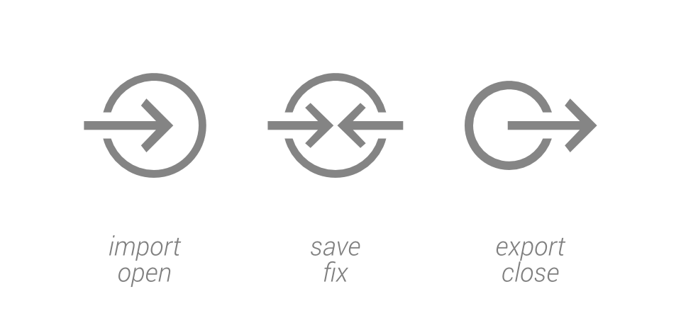
So: starting a project or a document would mean to open or import your file into a certain frame of time – your workflow – a simple arrow into the circle representing time will do.
Now while you're working on the document, you might want to fix its progress from time to time within the workflow – you want to fix its state in time. Would two arrows pointing inside the circle work nicely?
Finally, once you've finished the project and want to save it permanently, you're going to export the document. Maybe you even want to continue working on it with another tool? Again: import, save progress a couple of times, and export eventually. How about simply an arrow pointing out of the circle?

Pretty easy, right?
To wrap this up, I crafted those three icon proposals as Android actionbar icons in Holo Light and Holo Dark. Grab them for free below, if you're feeling brave enough to leave the floppy disk behind, once and for all.


