Home Is Where The Cookies Are
Icons, designed by a 14-year-old
In interaction design and visual communication, we rely on metaphors and patterns that seem established and well-known. As time goes by, we revisit some of them and question their contemporary legitimacy. Is the magnifying glass still a good representation for a search? How does the ever-saving floppy disc stand the test of time? Once adopted, we assume that those metaphors communicate clearly forever, for young and old alike.
Bobby was our intern for two weeks, a couple of years ago. He was interested in design and interfaces, so I gave him the assignment to draw up some metaphors for an icon set we were commissioned to create at that time. Most seemed like obvious solutions to me, so I certainly didn't expect the creative extravaganza he handed over to me a couple of hours later.
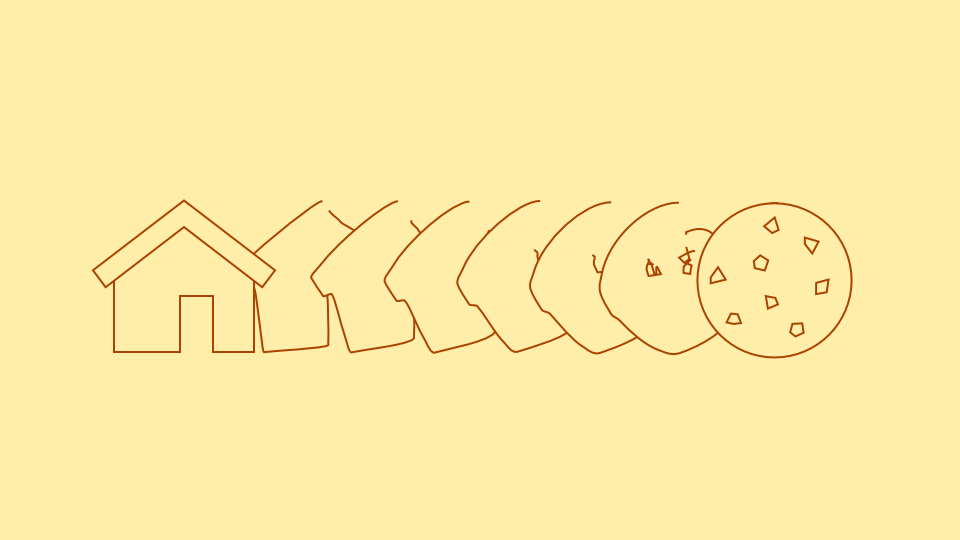
One of my favorites is the mother presenting a tray of cookies as his personal interpretation of ‘home’. What kind of emotional connection would a kid like him have to a classic one family house, when he might be living in a high rise?

Also, note the pop culture influences in his drawings, like The Legend Of Zelda’s Link as a web-link, or the iconic Clockwork Orange eye for a clock. Hellraiser’s Pinhead also gets his cameo due to his name.

The most interesting sketches, though, are based on human language variations. There’s a log of wood within a small house and outside of it, as interpretations for ‘log-in’ and ‘log-out’. The wave or shower for ‘refresh’ is also closer to natural language than two arrows displaying a circle.

After having designed icons for more than 10 years, I had to admit that the boy taught me quite a lesson. Not only did he summarize the complexity of human language in a couple of quick scribbles—he further added a level of creativity to the task that had been lost under the pressure of standardization.
Enjoy the whole set below.
![]()


