User Experience is King
An interview with Taylor Ling, Designer
Taylor Ling is a passionate advocate for great UI and UX Design. Famous in the Android realm for his (re)designs that focus on clarity and usability, he is frequently invited to speak at conferences all over the world.
Taylor’s blog androiduiux.com is one of the most substantial resources for inspiration and wisdom concerning Android design and development. On Google+, he shares profound insights into best practices in Android, UI&UX, and especially the new Material Design.
We jumped at the opportunity of talking to him about User Experience Design, the future of Android Design, about becoming great at what you do by just doing it, and the responsibilities of a digital designer today.
A couple of weeks ago you were appointed an official Google Developer Expert (GDE). Congratulations! What’s your role and responsibility there?
It’s not much different to what I’ve been doing all along: sharing tips and tricks, engaging with the community, helping out with design questions. I talk to designers who are looking into Android Design, or are interested in working with Android in general. I try to figure out how designers can help out developers to realize some of the more complex design stuff. So becoming a GDE has made not much difference, for me at least.
“What I took as my aim when I became a GDE is to help reduce the gap between the designers and the developers.”
Bridging that gap is so important, because most of the time the designer will come out with an awesome design, but the developers have no idea how to implement it. The main problem is that they don’t understand why we do certain things. So as a GDE we can jump in and tell designers: “Hey, besides creating awesome designs, you have to let the developers know why you want something to look like you envisioned it, why this is important for user interaction, why this icon is meaningful. You can’t just use another icon to represent this action, because...” and so forth.
Many times I see people from different design backgrounds, like print designers or graphic designers, coming into the mobile app space. Of course, I mean, this is still the thing that’s growing. But most of the time, they bring issues that they have experienced before to mobile app design, without actually knowing the fundamentals of it, without knowing what the developers will need from them to transform their design into code, because they often lack knowledge of the design guidelines. So we try to deliver this message to blog posts, to conferences, and so on: make something the developers know how to use. I often hear developers saying: “The designer sent me this design, but he never sliced the assets, so now I have to do it myself in all the different densities.” So we try hard to share our knowledge, our experience, problems we have encountered.
Three years ago our aim was still to create a community. Now there is one—not huge, but sizable I’d say. And you can learn things there. So the GDE is a more formal way to get those messages across. To minimize the gap between the design and the development part.
“Those two guys, the designer and the developer are not supposed to be enemies, but allies—they’re inseparable. Only then they are able to create awesome stuff.”
Your focus is on UI and UX design. Recently, UX has become such a buzzword that nobody really knows what it means anymore. Everybody wants to be a UX designer, because that’s the cool thing to be. So, for you who has been immersed in that for a long time, how would you define UX?
This is always a very tough question and people will have different viable answers to it. Many people know that the user experience is important, but it’s something quite intangible. It’s not something you can see. It’s in the finished product.
You know when you have a bad user experience, but you don’t notice when you have a good one.
Exactly. When we talk about user experience, it’s always about the bad one. No one will remember the good user experience, because they just achieved what they wanted. If it’s a bad user experience, you will remember it for your whole life and say “Oh no, not this product, that was horrible.”
By definition, of course, it’s simply the experience that the user has. But if you talk about what UX Design actually is: it means crafting a mindset into the entire process and organization. Having sympathy with the user, understanding that the experience of the user is equivalent to how successful your product is. That doesn’t mean your product will be successful just because the users love it, but it’s the first step.
“UX is a mindset, and it’s relevant for every part of the product: interaction, interface, copy. Every single part plays an important role in crafting a good user experience.”
I have one friend, a UX advocate, who goes across the country promoting the importance of UX. He actually went to a job posting site and looked for all the jobs related to UX Design. Then he went to the interviews. To every single one, just to do research. He wanted to see how much these companies actually understood about what they needed. In the West it’s probably a little better, but in this region, he found that 95% of the companies were looking for the wrong person. They were looking for a unicorn: a guy that can do development, design, and everything else all at once. That funny little experiment shows we still have a long way to go to push UX forward. If you want a good user experience in your product, it’s not just hiring one person who sits around and your product will automatically be awesome or loved by people.
How did you know you wanted to do UI & UX Design? How did your career path come about?
A lot of people are surprised when I tell them I have a biomedical engineering background. And I loved that. It’s a lovely cause learning about anatomy combined with engineering disciplines. But in my country, it’s tricky finding a job in this field outside the lab. And I didn’t want to be a researcher in a lab. So boring. So I was thinking about what I could do with my life. Design was something I was always interested in, even before university. I loved drawing, even won a few awards in school. It’s in my blood. I love art.
I got my first job as a functional analyst, which is a job that helps translating the product manager needs into a low level requirement set, so the developers know what to do. But, of course, there was no designer in the team, so I had to do the design, the layout, everything. I wasn’t aware that this was something you could earn money with.
It wasn’t until about three years ago that I started looking into blogs. I found Juhani Lehtimäki’s blog, talking about Android design and thought “OK, there are people talking about mobile interface design—that’s interesting.” At the time I wasn’t all that clear about it, because Juhani is still a developer, and I didn’t have a strong technical background, so I wasn’t sure if that was something I could do.
During that time I also got my first Android phone. A Sony Ericsson Xperia X8. It has a very small screen. I played around with it and was so amazed that I could do so many things I never imagined were possible. That was the Gingerbread era. The apps were designed somehow, but there was no consistency at all. At that time, the iPhone came out in the second generation, so I was asking myself why high-quality apps were only available on iPhone. It was very expensive. I wondered why I should buy an expensive gadget to get a high-quality digital experience. Why couldn’t I have that on an Android device?
So I played around with it a little more and eventually I got myself a Nexus S via my local mobile carrier—that was pretty much when Ice Cream Sandwich (4.0) was announced. And I was so excited about it and made my first ever Photoshop Android UI Design Kit. After some time, I decided to start a blog about Android Design, which was in June 2012—I wrote about the side drawer, the navigation menu. That was the first blog post I ever wrote. And it started from there.
“Initially, I just wanted to share stuff.”
Did you get any responses?
Yeah. The response was so good that all the sudden I knew: “OK, this is something that I want to do.” That’s why I bought that domain androiduiux.com, really dedicated to Android. It’s something I want to keep reminding myself: the focus is pure Android.
So the feedback was coming in, people actually responded, and I was happy. And it’s two guys: Juhani and Roman Nurik. They really inspired me to see that if you have an opinion on something, don’t be afraid to share it. And that’s how I got into the design thing. After one year of running the blog, people came to me and asked for help doing redesigns. I never planned anything, but then all of a sudden I was a freelance designer.
But Juhani Lehtimäki and Roman Nurik, they were far away, right? I mean, you were connected through the web, but were there any mentors in Kuala Lumpur who lent their hand and helped you along the way?
Yeah, the power of internet! About the mentorship—no. It’s all self-taught. My photoshop skills I simply learned by feeling my way, by trial and error, a few tutorials. But there was no one mentoring me. I always thought I was able to do that myself. And yes, maybe that takes a little longer, but if you do it yourself it will have a more lasting effect. You learn how to acquire new skills. Back then I didn’t have a computer, so I flipped through magazines to learn how to do stuff. My first computer was a intel-powered PC with Windows 95, and that’s where I saw all that potential.
So I’m just a little proud of myself here, because, I mean, it’s not easy.
“Of course, there are design classes, or classes about human-computer-interaction, but they take you four years—and sometimes, when you talk to people who teach these classes, you think, ‘Dude, we’re already so far ahead of you, as a community.’ Because what they learn are things that are still maturing and so theoretical. And for me, it’s really about the real experience, the real feedback, the way I actually feel when I use something digital. And as you learn by doing, you remember it forever.”
What had a huge influence on me was reading The Design of Everyday Things. That changed me and the way I think. One thing that we tend to not understand is that when we fail to operate a machine or device, it’s the designer’s fault, not ours.
But I strongly believe that if you’re passionate about something and you want to become good at it, you are able to achieve that yourself. That’s something I learned starting out and it has taken me to where I am now.
Switching from the past to the present and into the future: Google just introduced the Material Design guidelines at I/O this year, as a new direction. Is this a trend or really the future of Android. Where is Android Design headed?
One thing that Material Design has changed is obviously cross-platform consistency. I do have some doubts about that, because, just as an example: if you have an iPad, you have a very unique experience. So the doubt I have is whether the user wants to have a consistent experience or a unique one. But I have decided to ride the wave, just because Material Design is awesome, very well thought-out.
For me, it definitely is the future. But it’s very similar to when Holo Design was introduced two or three years ago. During the early stage, everyone would just follow exactly what the design guideline proposed. That’s why many apps would lack variation and innovation. If you follow what’s going on now, there are people actually doing redesigns of Instagram or Facebook with Material Design. But none of those are unique or show variation. They’re just replacing the colors and the content, and then call it a redesign. Which is not a bad thing, because it will make people realize the beauty of Material Design, but I think in the coming months we’ll see a lot of apps looking exactly like the Google apps. People are still exploring, they don’t have a clue yet. We’ll see round avatars and floating action buttons everywhere. That’s normal. But we’ll need to start thinking out of the box again.
I still think that users will want unique experiences on desktop, tablet, and phone. I understand the consistency they want to achieve and I agree, in large parts. It’s important, but I don’t think uniqueness should be sacrificed.
Generally though, the introduction of Material Design, was mind-blowing. I’m very happy about it, because you can feel that it was created specifically for the digital space.
“Material Design brings back some real-life things into our digital life. It allows the user to interact a digital product without much thinking and processing which is very important in the long run.”
This is drawing on the difference between the skeuomorphism and the metaphor concept that they’re introducing: it’s not just depicting the real world in the digital space, but more of a transferring action.
The choice of the paper-and-ink concept, I think, may be a little confusing to some people. Because they have some unique properties in the real world: paper can fold, ink is a liquid and flows, etc. So developers and designers start asking questions like: “If it’s paper, why can’t I fold it?” Those who are not actually going through the guidelines, they might be confused. But they have to realize that the digital space is a constraint. It’s a human touch Material Design is bringing into the digital space, which I love.
“The interfaces in iOS are cold. Material Design is very focused on what the users actually perceive and making them realize what’s happening with less processing going on.”
Somehow, it’s really a human thing, I suppose: when I was in London, I went to the British museum and they have an exhibition about ancient Egypt. I found it amazing. 4,000 years ago, they already had a grid system, iconography, subtle use of color. Isn’t that crazy?
As a designer, your work has to be highly creative. How do you come up with ideas?
There’s really no ritual involved. I try to be inspired by everything—nature, people, landscape. And conversations. A funny thing is, I do a lot of eavesdropping—or let’s call it observation. Not that I would follow people around, but I like hearing what other people talk about, what moves them, what concerns them, and so on. I like to listen to their conversations. I feel that this has often helped me keep the user of the product I design in mind.
I know you have a deep interest in typography. What do you think of the Roboto redesign?
It’s good. When I look at it, it already feels more familiar, maybe because it has become more similar to some very established typefaces. And it works very well across platforms. I can already see that those minor changes have a great impact, improving readability. It looks fresh, but it’s still the Roboto you’re accustomed to. It finally feels like home.
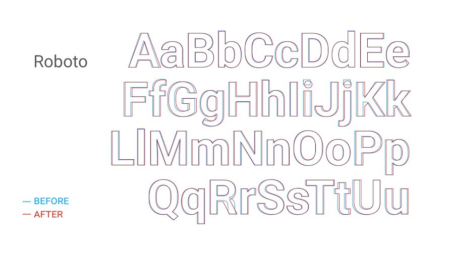
I like it, too. The only thing I feel a little sad about is that they got rid of the more opinionated strokes in the “K” and the “R” that gave a little playfulness to the font. But no matter. Are you reprinting your t-shirts now?
No. That’s just a part of history.
Do you own any wearables: a smart watch or Google Glass? Do you design with those in mind? What do you think about them?
Yes, of course. Before I actually owned a Google Glass I designed two Glass applications, just by following the guidelines very closely. When Google Glass came out, there were clients approaching me and asking how they could transfer their product to Glass and if I could design something special for it. That comes back to typography as well, because those wearables are terribly text-heavy.
I own the LG G Watch given out at the I/O, but so far I haven’t designed anything for that. Still, you can see the trend that people are already heading the wrong way. They try to make a phone out of the smart watch. They put in a keyboard and other processing-heavy stuff and that’s discouraging, because they’re actually doing things Google says not to.
“One thing is true, though, I think: those wearables have the potential of changing the way we think about design itself.”
What does a day in the life of Taylor Ling look like?
(laughs) I’m a pretty normal guy. Once I get up I check my news to see what’s happening in the world while I’m sleeping. I use Feedly and Google Newsstand, mainly, and of course Twitter and Google+ are good sources to keep up-to-date. Once I reach the office I check my tasks, do a stand-up or catch-up with the team. And then the daily business of research, playing around with apps, design in photoshop, etc. So a pretty normal app development cycle.
Once I reach home, I do my freelance work, and that looks about the same. My day is pretty packed. But I’m happy about it. I believe if you do more, you gain more, you experience more.
What are the tools you work with?
To be frank, it’s only Photoshop. That, for me, is such a powerful tool, because not only can you create mockups and complete designs, but it also allows you to do animations. Oh, and I use Sketch, too, but not so much. So far, nothing beats Photoshop.
Especially in Material Design we talk a lot about feedback, animation, and moving stuff to enhance the user experience, so it’s important for designers to know how to create that to be able to show developers what they actually expect from them. Sometimes I also do that with PowerPoint or Keynote.
I loved your Android Design challenge. What was the motivation behind it?
This is the second time I’ve done it, but I had the same goal in mind: promote Android Design and inspire people, show them what can be done. That’s true to my principles, too. The subline on my blog is “Inspiration source for developers and designers”. That’s the aim. A lot of times, if you give people some kind of incentive, they will actually start doing something and they might outgrow themselves.
As a designer, you want to get recognition for what you do. So I kind of already knew this would get their attention. I talked to some community friends, like Juhani and Günther Beyer, whether that was something feasible to do. And they gave me their full support by being the judges.
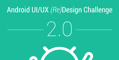
I’m very happy about the participations this year. Compared to the first year, this second round I received far more entries, and more quality entries, too. So it’s already starting to mature. More people are doing an amazing job, which is great to see.
I paid for the first round from my own pocket, which was fine for me, because the designers really put a lot of effort into their designs. In the second one I had some small sponsorships from a few people.
And why I do it? Well, I’m just really a community-driven guy. I believe that when you give much, you get much back in return. And I do get a lot of stuff from them, so I try my best to give something back.
Do your family and friends support what you’re doing? Do they understand it at all?
My parents are still not very clear about what I’m doing, even though I try hard to explain it. But they are extremely supportive. One very strange thing is that they can’t really believe I went to London and Tunisia to give talks. And I didn’t expect that either.
Are you happy? What are your plans for the years to come?
Am I happy? Yeah, of course. I couldn’t be happier. I mean, I’m doing the stuff I feel really passionate about. I actually made a lot of friends I never even expected to meet. I gained much more than I ever imagined, and I’ll definitely continue to do what I’m doing now—being an advocate for my industry, trying to push the right things. I will go as far as I can, and do as much as I can.
What advice would you give someone who wants to follow in your footsteps and do the same as you do?
Train your eyes. Be picky. Be passionate about what you do. If you keep your passion alive and work with it, everything will fall into place.
